Heuristic Evaluation of the spotify app: A considerate attempt for improvement
About the project
Type: Heuristic Evaluation on the spotify app
Duration: 2.5 days
Solo project: by Kathy Shahwaladi (product designer)
Motivation
Every day, as I pick up my son, his eager request is always the same: ‘Can we listen to some music, please?’ Our drive home is accompanied by his favorite tunes, and Spotify has become an integral part of this cherished daily routine. It’s this personal connection, the way Spotify seamlessly weaves into the fabric of our daily lives, that inspired me to select this app for evaluation.
About the app
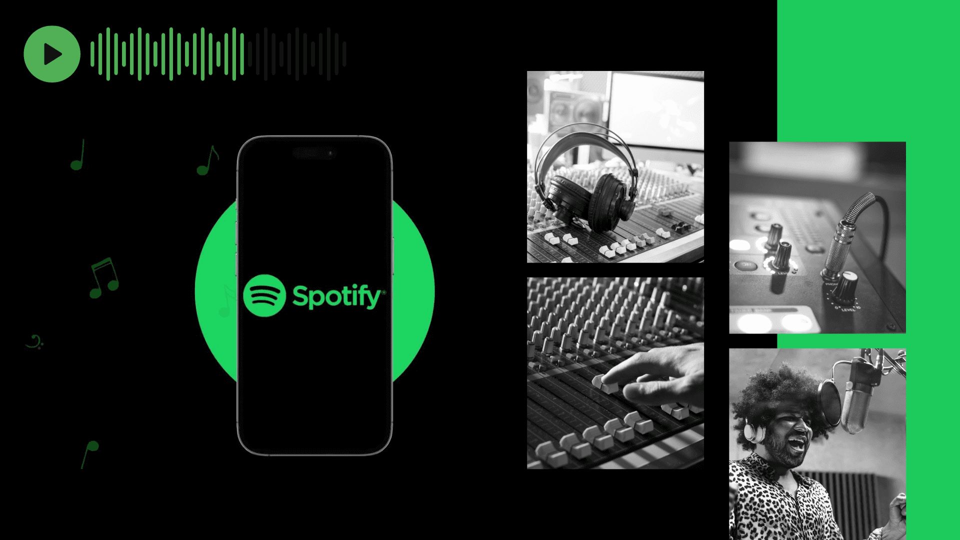
Spotify isn’t just an app; it’s a revolution in how we listen to, discover, and share music. With a vast library of songs and podcasts from around the globe, personalized playlists, and cutting-edge features, Spotify has become the soundtrack to millions of lives worldwide.

Heuristic Evaluation
Heuristic evaluation is a method where evaluators examine digital products using a set of guidelines called heuristics. It helps identify usability issues and areas for improvement in the product’s design and features. The goal is to make the product more user-friendly and enjoyable by providing valuable feedback to the creators. By following the suggestions from the evaluation, the app can become easier to use, more intuitive, and give users a better overall experience. For this project I used the 10 Usability Heuristic Principles by Jakob Nielsen’s which appears to be standard in the UX design world.
Nielsen’s heuristics provide a comprehensive framework for evaluating the app’s interface design and interaction, helping us identify strengths and areas for improvement.
Evaluation Criteria
There are 10 evaluation criteria based on Nielsen’s 10 Usability Heuristics.
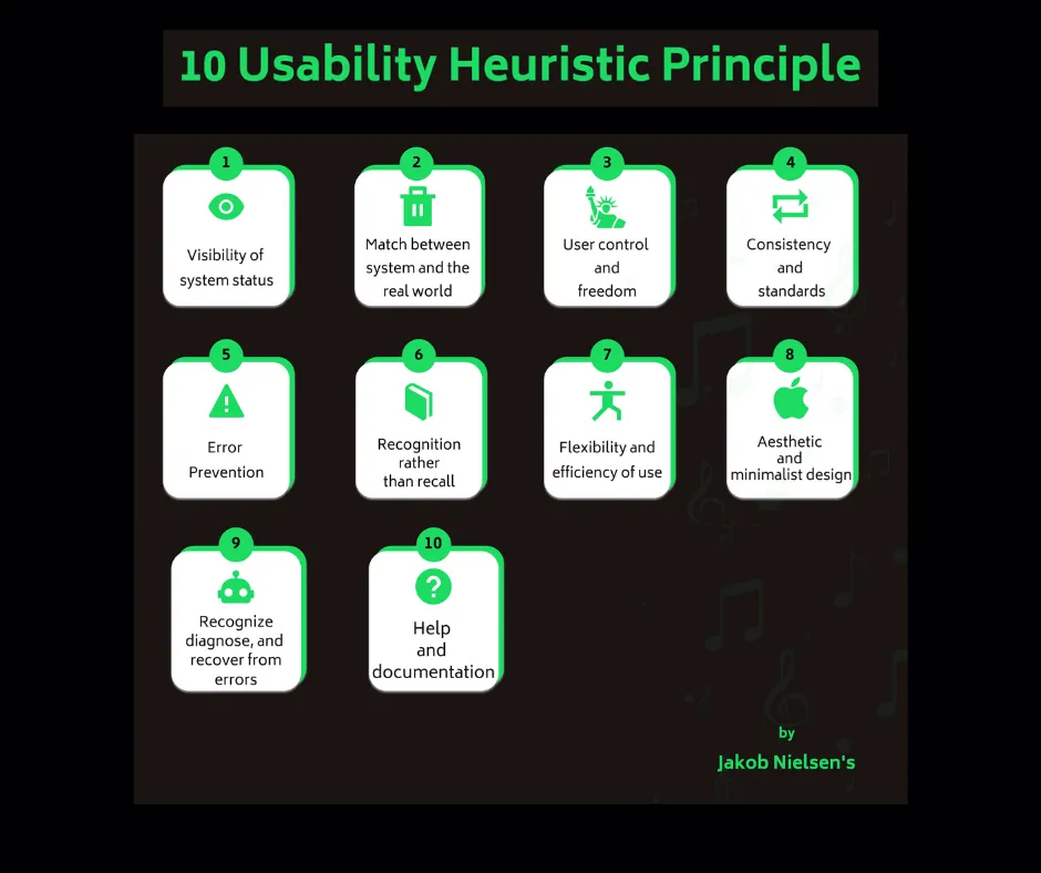
Visibility of System Status:
Users should always be aware of what’s happening within the system. This principle emphasizes providing feedback to users about the system’s current state, such as loading progress or error messages.
Match between System and the Real World:
The system should use language, concepts, and metaphors familiar to the users. It should speak the users’ language and present information in a way that aligns with their mental models.
3. User Control and Freedom:
Users should have the ability to undo actions or easily exit undesirable states. Providing “emergency exits” like cancel buttons or clear pathways for recovery from errors is essential.
4. Consistency and Standards:
The design should follow established conventions and standards, both within the application and in the broader industry. Consistency in terminology, layout, and behavior reduces cognitive load.
5. Error Prevention:
The system should be designed to prevent errors or guide users in avoiding them whenever possible. This includes confirming potentially destructive actions, offering defaults, and validation checks.
6. Recognition Rather than Recall:
Users shouldn’t have to remember information from one part of the interface to another. All relevant information should be present on the screen or easily retrievable through navigation.
7. Flexibility and Efficiency of Use:
Experienced users should be able to perform tasks quickly. The interface should accommodate both novice and expert users by offering shortcuts and efficient workflows.
8. Aesthetic and Minimalist Design:
The interface should be visually appealing and present only essential information to avoid overwhelming users. The design should be clean and uncluttered.
9. Help Users Recognize, Diagnose, and Recover from Errors:
Error messages should be clear, concise, and offer constructive guidance on how to resolve issues. Users should understand what went wrong and how to fix it.
10. Help and Documentation:
While the ideal user interface should be self-explanatory, it’s important to provide users with easy access to help and documentation when needed. This includes user manuals, tooltips, and contextual assistance.
Heuristic evaluation on Spotify
My Findings:
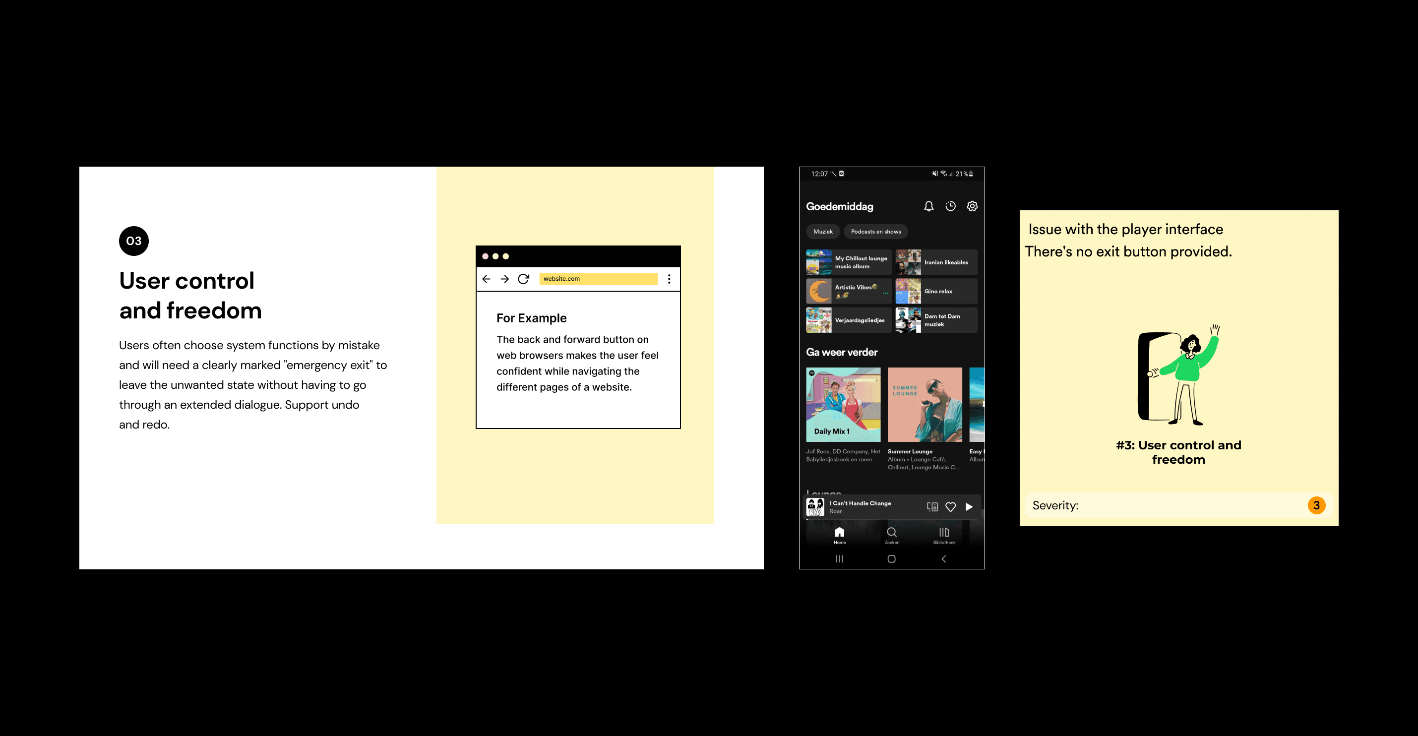
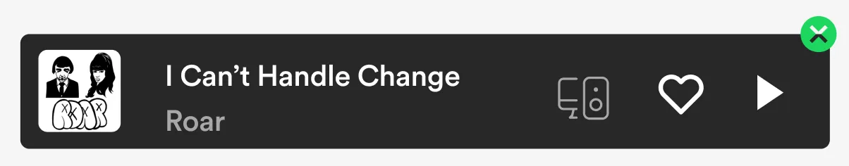
No close option on the Player interface (Now playing Bar)
When using the Spotify app, I noticed an issue with the player interface. When I stop a song I no longer wish to listen to, there’s no way to remove the player bar from the screen, as there’s no exit button provided. This can be inconvenient as it obstructs a portion of the page, impacting visibility. Additionally, if my phone has a connected widget, this song continues to display there as well, sometimes leading to accidental presses and playback. While I understand the intention, it’s important to allow users the option to choose when to clear and close this player bar.
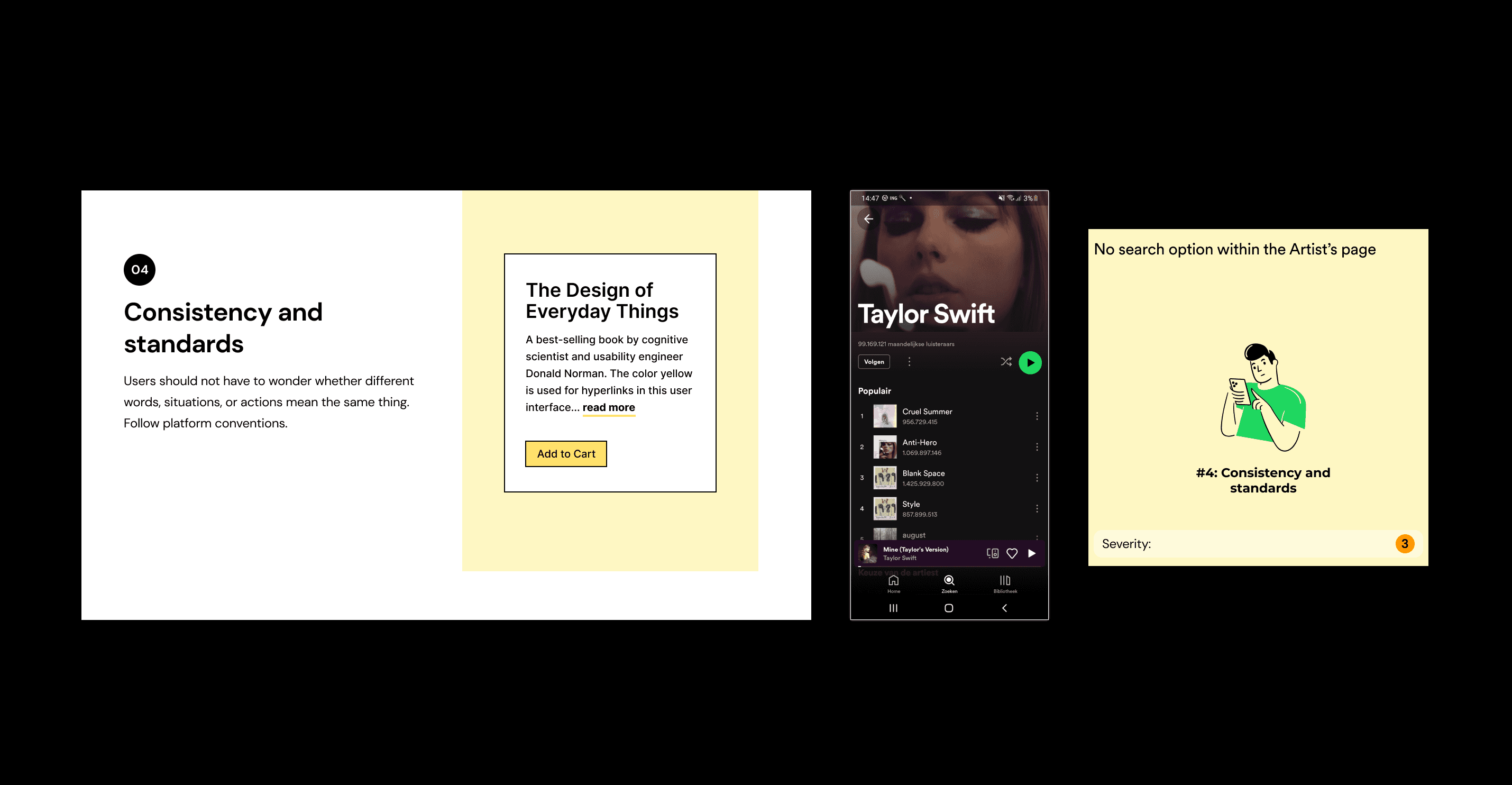

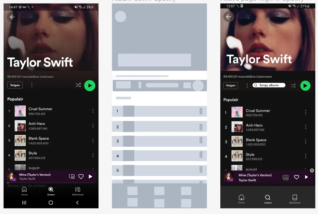
No search option within the Artist’s page nor on the Podcast’s page
When entering an artist's page there is no search button there. You just have to scroll down and search manually. specially when an artist has many albums and many tracks it is almost impossible to have a quick search.
Also While examining the Podcast page in the Spotify app, I’ve noted the absence of a search bar. This departure from established design norms can disrupt consistency and lead to confusion for users. Having a search bar is particularly important for rapid content discovery and providing users with greater convenience
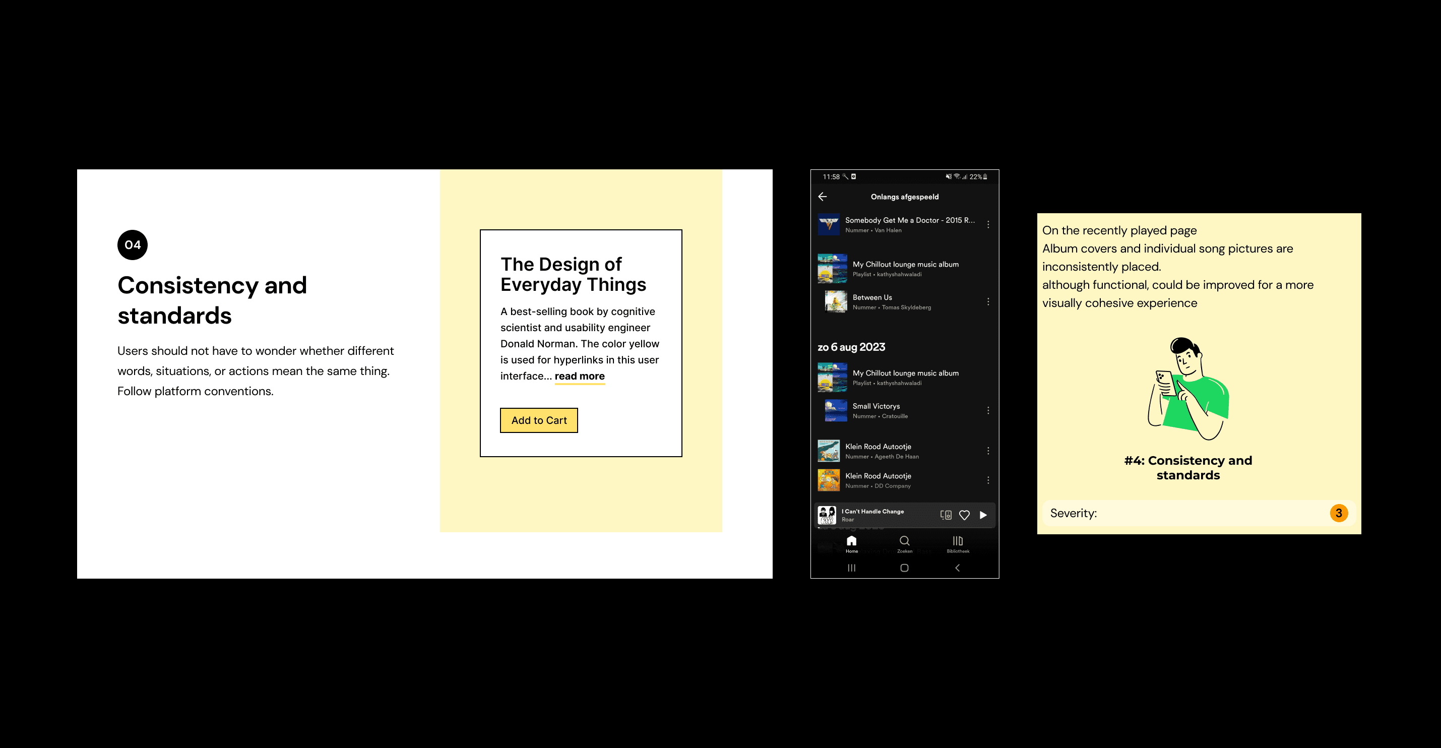
Missing the Visually cohesive experience on the recently played page
In the ‘Recently Played’ section of the Spotify app, I’ve noticed that album covers and individual song pictures are inconsistently placed. While I understand the intention behind this — using larger images for albums and playlists, and smaller images for individual tracks — there’s a visual inconsistency in the alignment. Tracks that are part of an album or playlist have a larger gap from the left side, whereas single tracks have smaller images but are still positioned at the same location from the left. This inconsistency, although functional, could be improved for a more visually cohesive experience.”

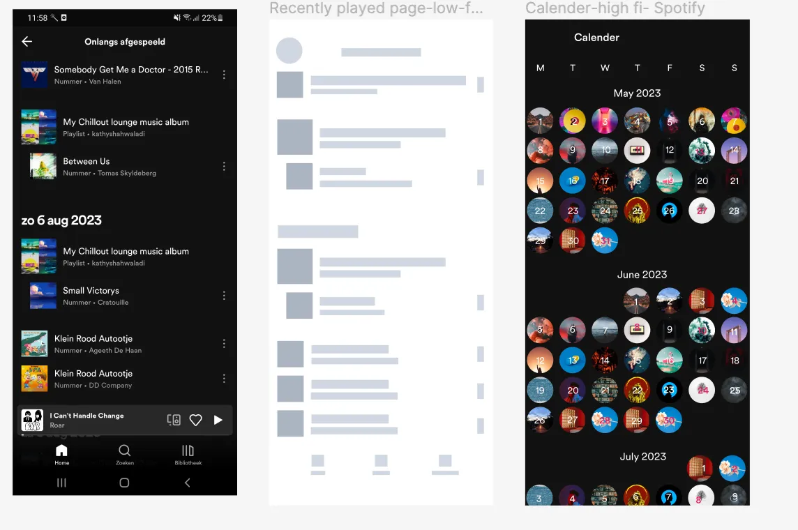
You can’t search for tracks by date on the ‘Recently Played’ songs page
In the ‘Recently Played’ songs page of the Spotify app, I’ve encountered a challenge in locating specific dates. Currently, there’s no efficient method to find the desired date; users are required to manually scroll all the way down, which can be cumbersome and time-consuming. For example one user wanted to quickly find a track that she had played on her anniversary last year, but she could’t search by date. So it was not possible to do this quickly.
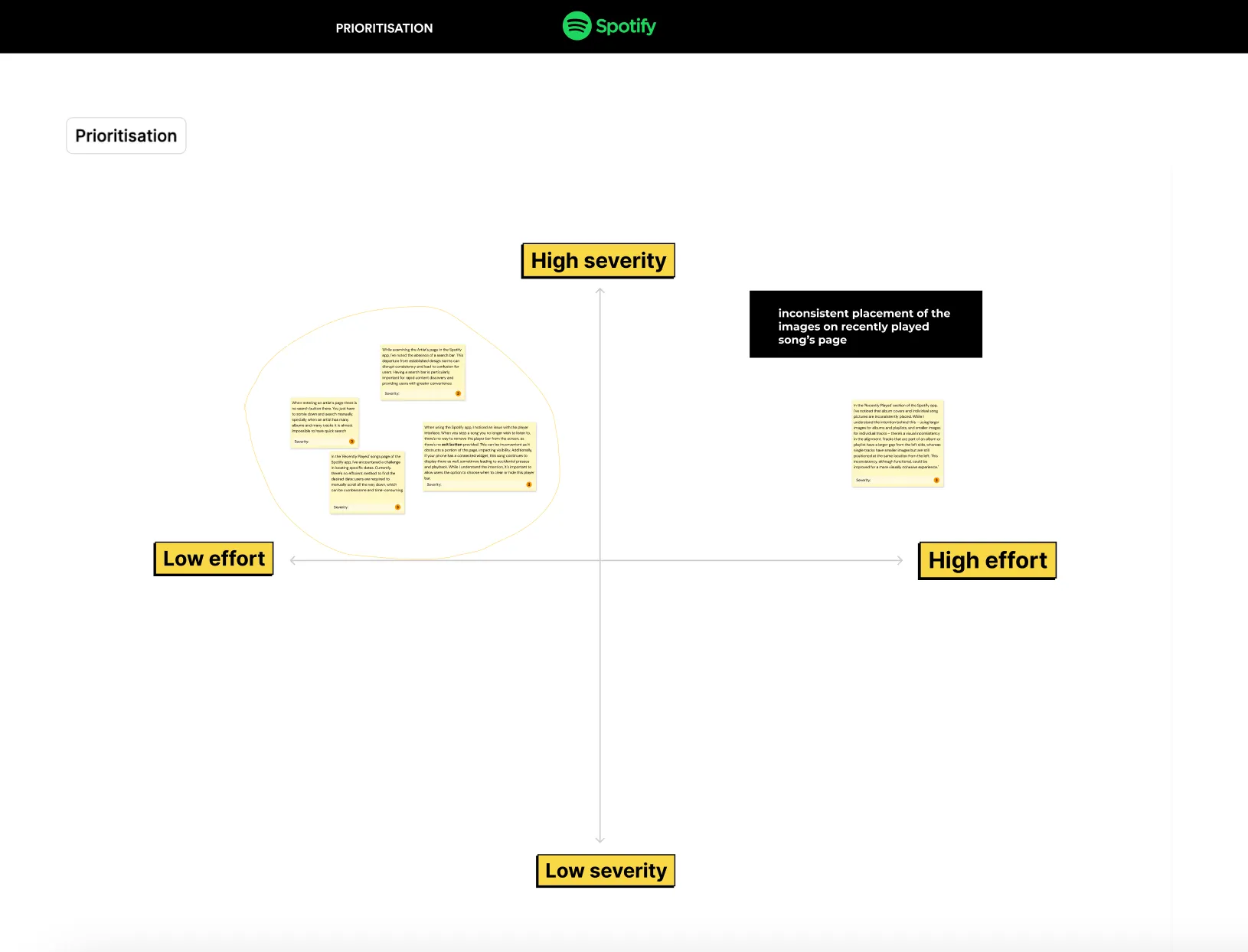
Prioritisation
After conducting a heuristic analysis, I employed a Prioritization method to determine the most critical issues to address. Due to time constraints, my focus was on issues with high severity and low effort. Consequently, I had to deprioritize the inconsistent placement issue on the recently played song’s page.
This issue pertains to Spotify’s hierarchy of albums and playlists taking precedence over single tracks, even when a track is part of an album or playlist. While Spotify’s approach is well-thought-out in terms of functionality, it may not be the most visually appealing concept.
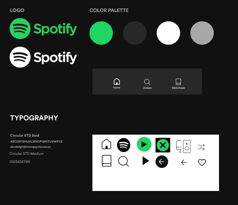
Style tile
To kickstart the redesign of the selected pages, I had to begin by recreating the style tile for the Spotify app. This involved collecting all the necessary design elements before commencing the actual design work on the canvas.
Ideation
(The crazy 8 sketches)
The problem solving phase has always been the most interesting part for me, and I find the Crazy 8 method to be the most imaginative approach to addressing design challenges.
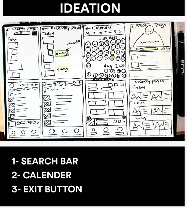
The Redesigns (solutions)
First solution:
My first solution was to simply add a close tap to the playbar.
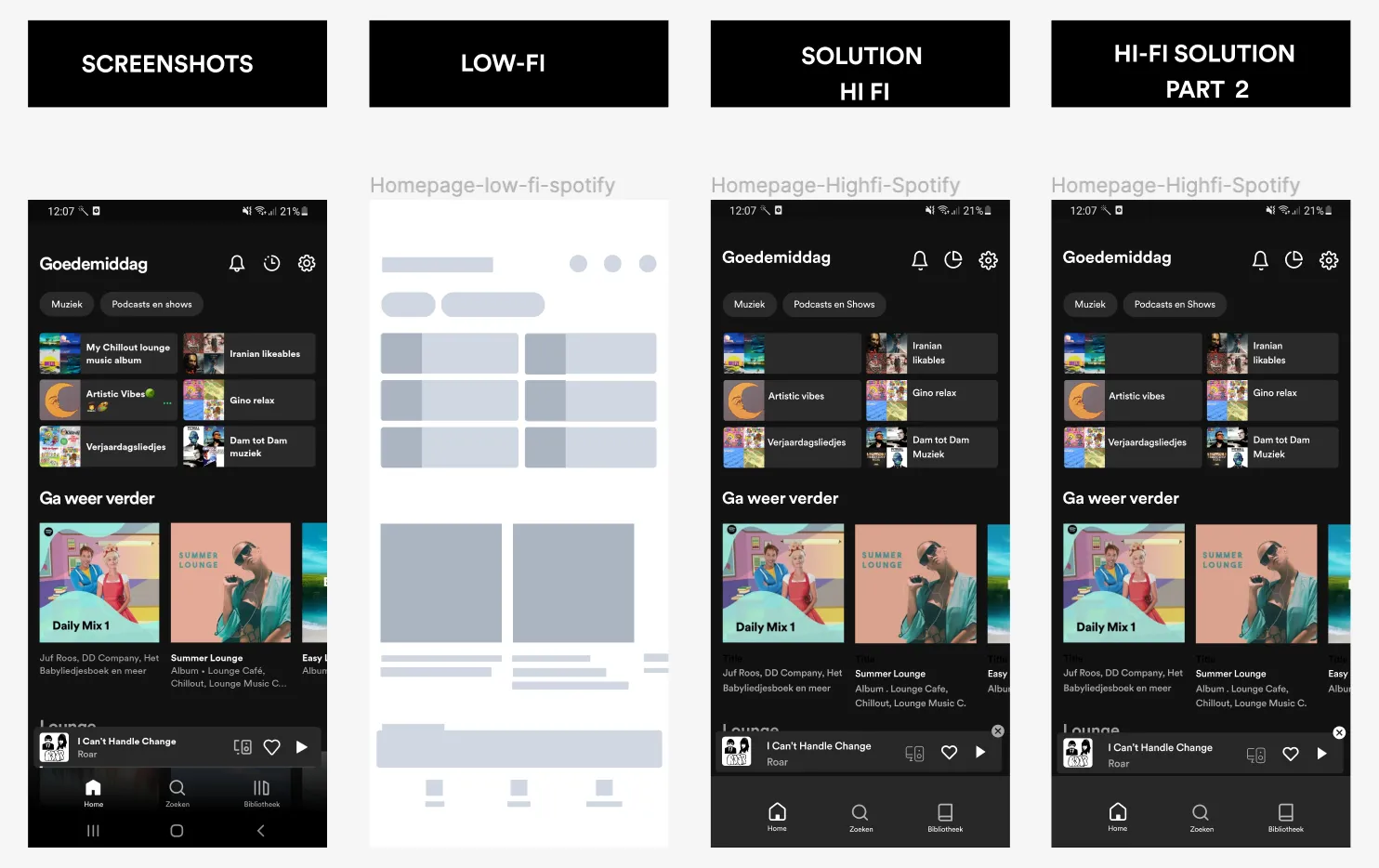
Second Solution:
The alternative solution involved crafting a calendar that opens by clicking on the dates in the recently played song’s page. The calendar was meant to visualize tracks for specific dates, with each date featuring a randomly selected cover image from the songs played on that day. However, due to time limitations, I had to develop a rapid design that can be further enhanced. For instance, improvements could include fine-tuning the circle sizes and enhancing the legibility of date numbers.
Third Solution:
This solution involved the addition of a search bar to the artist’s page. While I could have opted for a search icon to maintain a more minimalistic design, I chose to adhere to the app’s consistency by using the same style for this element.
Conclusion
As we wrap up this project, I’ve completed heuristic analysis, identified issues, and proposed solutions for redesigning specific aspects of the app. This experience has been truly remarkable, and I’m deeply honored to have had the opportunity to contribute to this app’s development. Working on this project has deepened my appreciation for the intricate and exceptional design style employed within the app, and it has also been an invaluable learning experience.
Next steps
As previously mentioned, I am committed to refining and enhancing the suggested solutions. If time allows, I plan to carry out iterations. The design process for apps like this is continuous and never truly concludes; it always evolves and progresses based on new findings and usability testing.
Learnings
Once more, this project proved to be exceptionally valuable as it required us to work independently, relying solely on our individual design skills. I firmly believe that this experience has been incredibly enriching. While I cherish the collaborative aspects of teamwork, I also relished the freedom of making autonomous decisions and channeling my creativity into the redesign process.