Imagine stepping into a world where colors aren’t just seen but experienced, where glass isn’t just a material but a canvas for stories waiting to be told. In a place where tradition and modernity dance a delicate tango, there exists a stained glass artist who has applied the essence of both to create a vivid tapestry of beauty. Welcome to the digital haven of my stained glass virtuoso, with age-old craftsmanship and the vibrant pulse of contemporary artistry.
Project’s specification
Team: 3 designers: Kathy Shahwaladi (me), Katie Huang & Mariana Veiga
My Rol: UX/UI designer
Duration: 10 days
In a nutshell: Rebranding and redesigning an existing website for a glass artisan who sells her art and workshops online.
Introduction
When I entered the room he was carefully cutting the vibrant green glass, with an unwavering concentration. The sheer finesse with which he worked left me in awe. What made his craft even more remarkable was when he shared that the exquisite art piece he was creating came to life from reclaimed windows of ancient Amsterdam buildings. In that moment, I found myself transported back to my roots, reminiscing about the old door of my homeland adorned with an array of colored glass. Waves of nostalgia and comfort washed over me, creating a profound connection that was as heartwarming as it was unexpected. That was the first time I saw a stained glass artist work and fell in love with it right away.
Starting the project
For this project, our main goal was to develop a responsive e-commerce platform that could be adjusted for rebranding, in case the business already had an established online presence. As soon as I encountered this assignment, I recognized the opportunity it held to delve deeper into this unique enterprise, reigniting my fascination with its intricacies.
Stakeholder
Our client is a young entrepreneur based in Amsterdam. A skilled glass artist who earned recognition by receiving the esteemed Young Talent award 2021 Dutch Portrait Prize. With years of dedication to her craft, she started her new challenge just one year ago, establishing her own atelier and venturing into her specialized niche business.
Interview with the stakeholder
During the client interview, it was communicated that the client’s aspiration was to establish consistent visual elements, ensuring a unified appearance, and to create a distinct brand identity. Additionally, the client expressed receptiveness to novel concepts and ideas.
User research
The insights
User interview combined with a usability testing of the actual website, provided us such a valuable information explained.
Narrative Confusion:
Upon entering the website, users faced difficulty in discerning whether it served as a portfolio showcasing artworks or an e-commerce platform offering workshops and commissioned artwork. This lack of clarity in purpose hindered users’ ability to confidently understand the site’s offerings and make informed decisions.
Unclear Workshop page:
Through secondary research and user feedback, it became evident that the workshop page lacked clarity in conveying the nature of the workshops offered. Users were uncertain about the specifics of each workshop, the intended audience, and the learning outcomes.
Disorganised Information And Buttons:
highlighted issues related to the organization of content and the placement of buttons on the website. This disorganization resulted in a cluttered appearance, making it difficult for users to locate essential information and navigate seamlessly through the site. The jumbled layout also contributed to a complex and overwhelming user experience.
Community-Driven Workshops:
As indicated by user insights, there’s an opportunity to capitalize on the concept of community-driven workshops. This approach involves fostering a collaborative and engaging learning environment where participants can interact, share experiences, and collectively learn. By incorporating elements that promote community engagement, the workshops could offer a unique value proposition and enhance the overall user experience.
Reviews And Social Proof:
Our findings, along with user feedback, underscored the importance of incorporating user reviews and social proof on the website. Potential customers often rely on the experiences of others to gauge the quality and authenticity of workshops. By showcasing positive reviews, testimonials, and examples of successful outcomes, the website can build credibility and instill trust among visitors.
Complex User Experience:
interviews revealed that the website was contributing to a complex user experience. The confusing layout, unclear navigation, and disorganized content hindered users from easily finding what they were looking for. Addressing this complexity is crucial to ensure that users can smoothly navigate the website, understand the offerings, and make decisions without unnecessary obstacles.
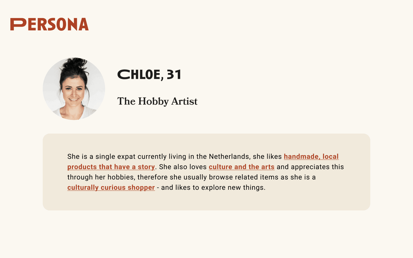
User persona
The user and usability testing brought us to Chloe, a typical user for our website. She is a hobby artist who likes handmade products with a story. But for her, navigating on Ellen’s current website seems a bit difficult

The opportunities
Based on all the information we received from our users, we identified several opportunities to enhance the user experience on this website.
How might we make her appear more easily when searching for her business?
How might we keep the Homepage clean and appealing, while presenting a clear brand and message?
How might we make the homepage feel clear and provide the right relevant information?
How might we Remove the workshops that are already fully booked, display clearly the available options.
How might we make the booking process feel more smooth, and reduce confusion for the user?
How might we provide clear information to the user regarding booking process and status?
Formulating the problem
From her pain points and navigation journey we built a problem statement to target the right functionalities and flow for the website, possibly helping Ellen to increase her workshops-revenue while thriving in her new dreams.
Problem statement
Curious adults who appreciate art and culture need a way to purchase artisanal goods and services because they want to learn something new while connecting to more people in their community.
Solution
The Ideation
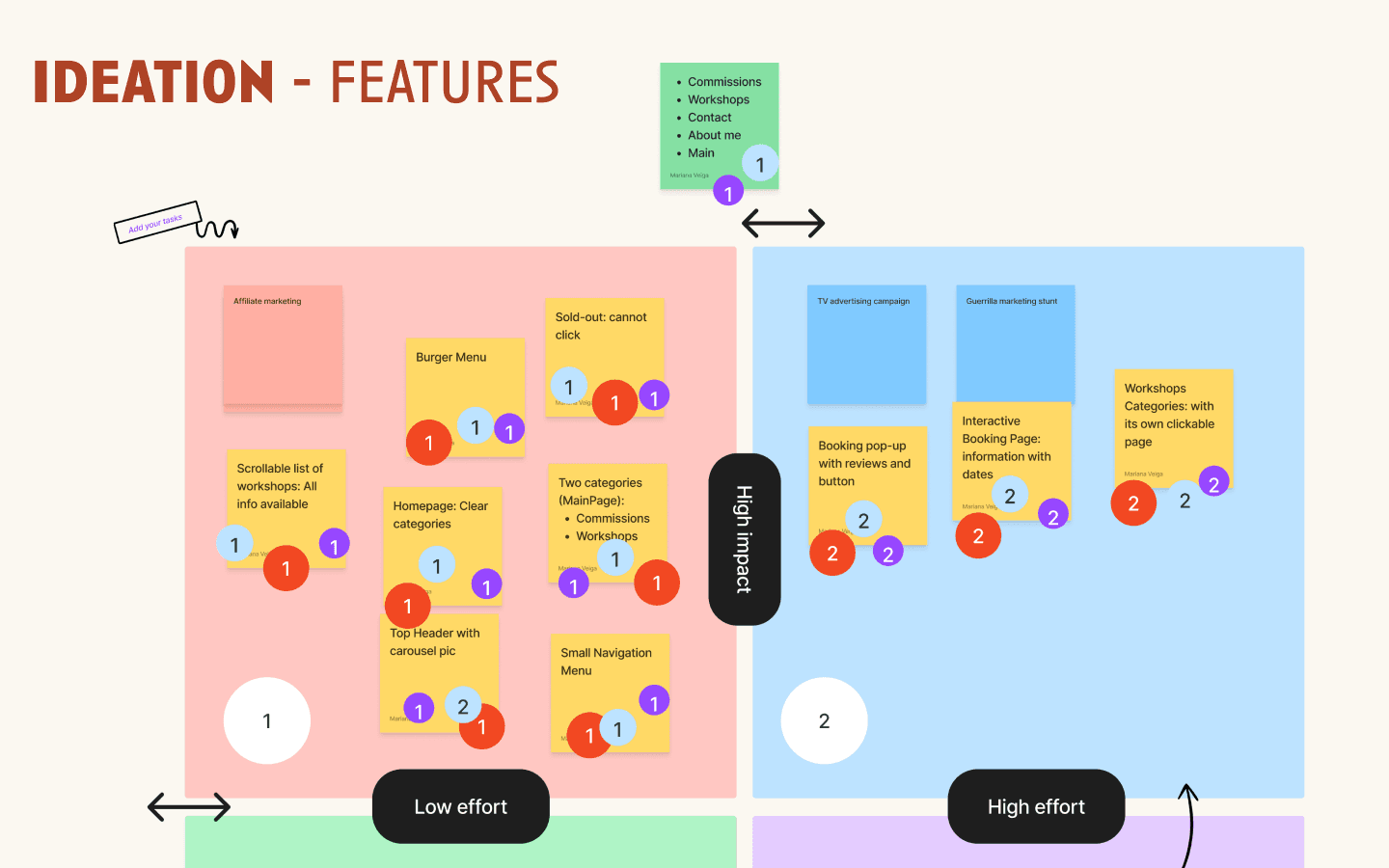
With a surge of enthusiasm, we transitioned to the Ideation segment — one of the most inventive phases allowing for boundless creativity and innovation: the Crazy 8 . Despite the day’s length, my anticipation remained palpable. During this exercise, we generated unexpectedly intriguing concepts, some of which resonated deeply and naturally found their place, while others were set aside due to varying degrees of enthusiasm. These determinations were also influenced by a voting process.
Zooming in to the feature prioritization
prioritising and voting voor the features that we wanted to include on the website was an important step.
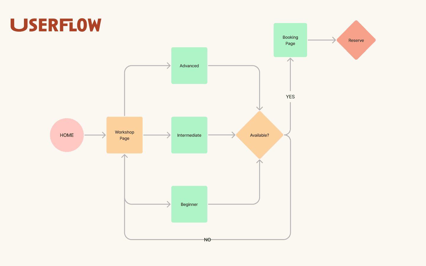
The user flow
At that juncture, we made the determination to concentrate solely on refining the workshop flow. This decision was driven by two factors: firstly, the primary grievances centered around the workshop page; secondly, the artist herself underscored that a significant 70 percent of her revenue originates from workshops. The inclusion of a shopping cart in our flow was also a subject of extensive deliberation. After careful consideration, we reached the conclusion that integrating the cart wouldn’t be advantageous for either the users or the business owner, leading us to opt against its inclusion.
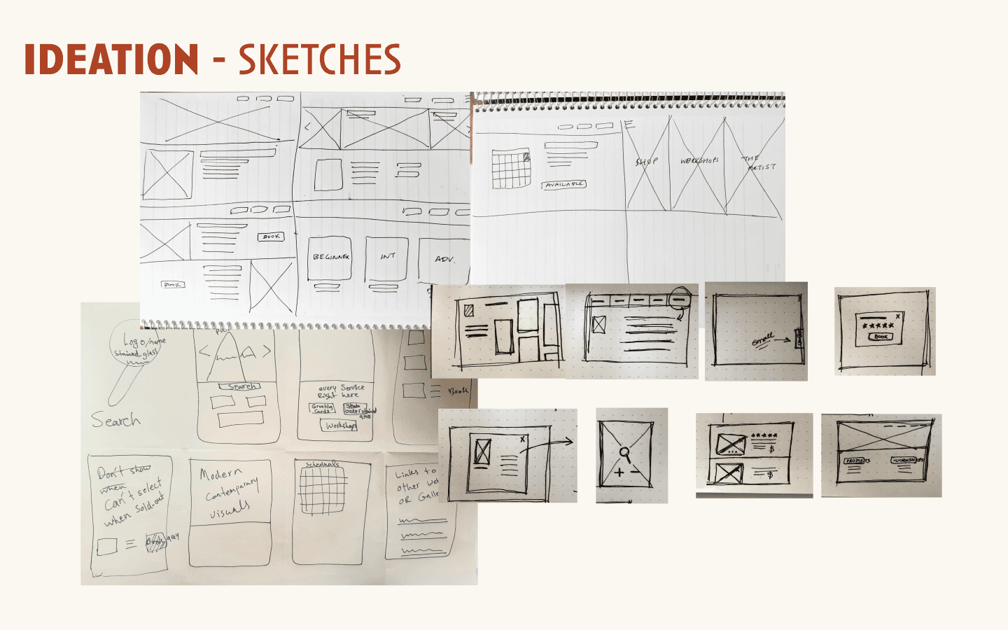
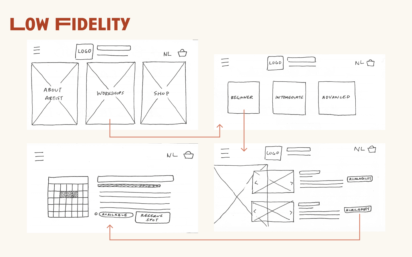
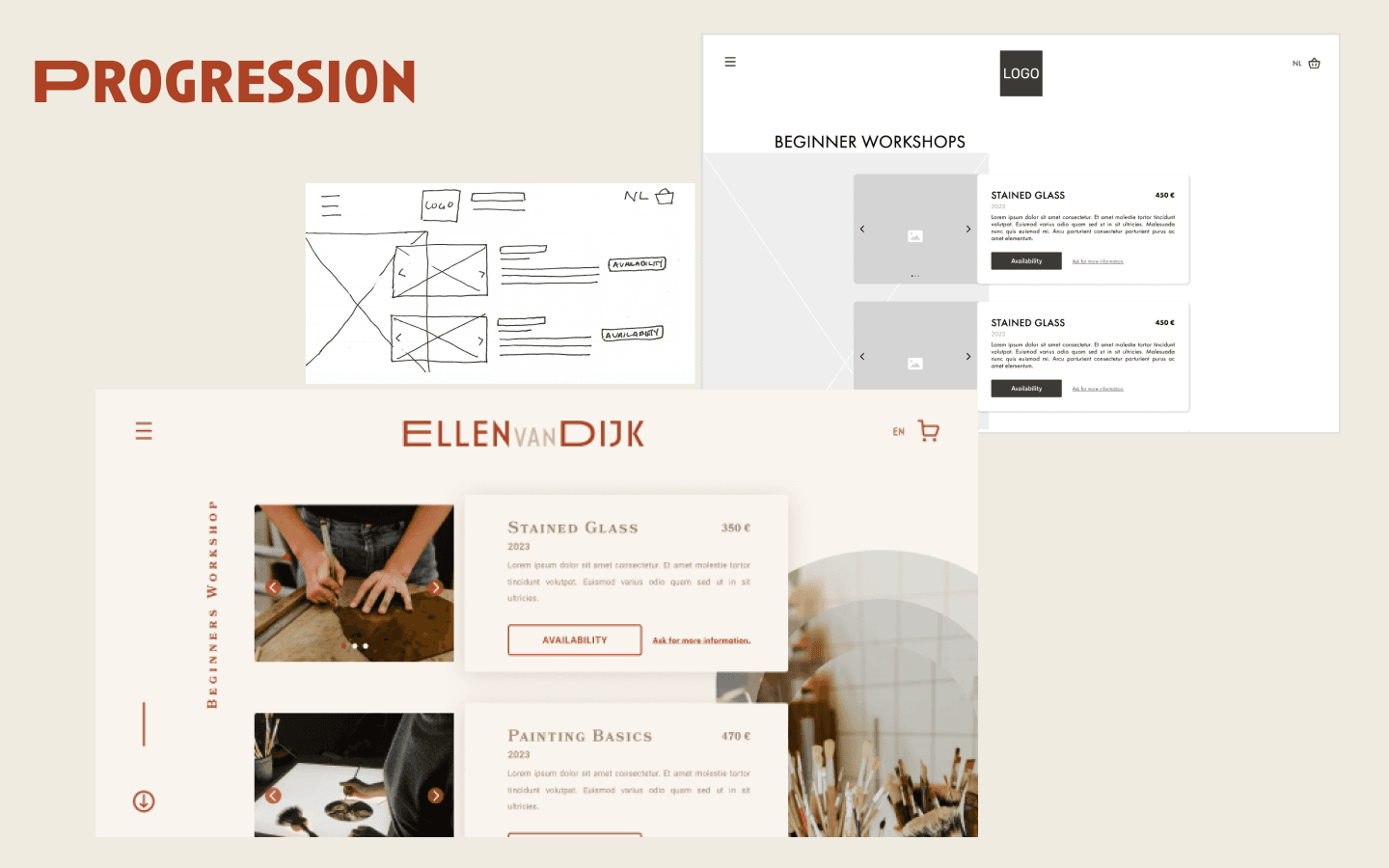
The low-fi Sketches
Then we began with a low-fi approach and then built upon it with mid-fi elements.
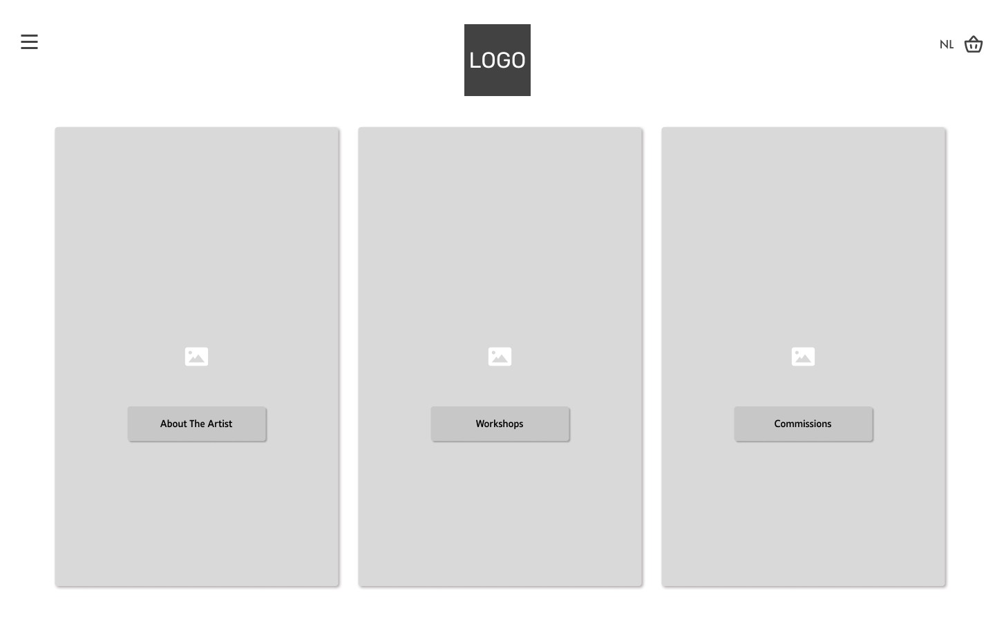
Mid-fi Wireframes
The main page consisted from 3 main categories divided by images:
1- About the artist
2- Workshops
3- Commissions
After making the two wireframes we did the Design critiques where other teams could view our findings and give us suggestions. Luckily there were only some clarification questions and no specific problem!
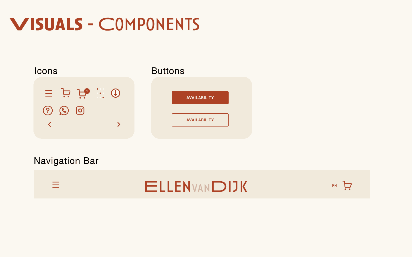
The UI elements
Visuals
And the party of creative brains started


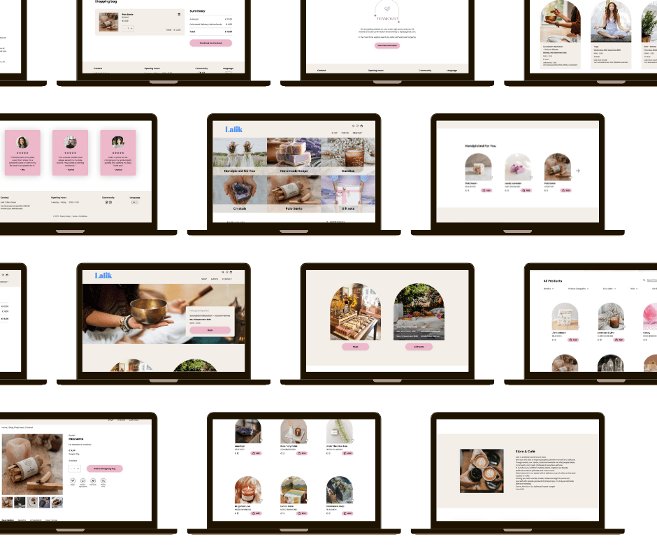
High fi Designs
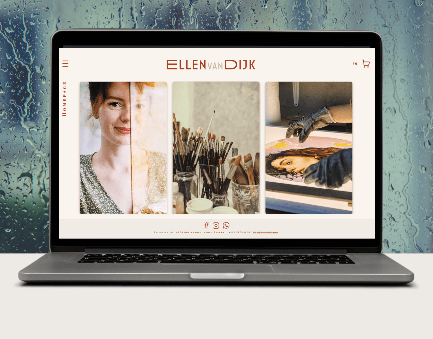
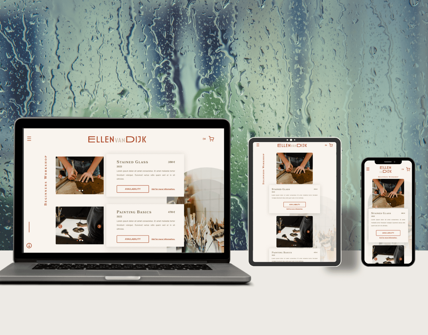
Link to the high-fi prototype
Progression
Usability Research
Users need early communication about the reservation process.
Learnings
Balance user and client goals equally
Consider the client — using testimonials instead of a rating system
Next steps
Add Information about reservation process earlier
Creating more dedicated commissions workflow
Personal experience with this project
I find contentment in the outcomes achieved, and I can confidently affirm that this experience has been a valuable learning journey once more. Throughout the process, there were instances of making concessions and, conversely, standing firm. Navigating teamwork amidst mental challenges provided an opportunity for self-discovery as a designer, ultimately contributing to personal growth.